The distinctive logos of movie-making studios greet audiences as they settle down with their popcorn. A master stroke of brand identity, each major player has their own particular image.
They’re one of the most prominent parts of any Hollywood movie, yet chances are people never think about them. However despite this status, behind each display is an intriguing history and a fascinating story to tell. Here is a selection of the most memorable of these…
5. Walt Disney
The iconic image of Uncle Walt’s fantasy castle has introduced many a blockbuster hit. Based on the Sleeping Beauty design, it was first seen in 1985 with the release of The Black Cauldron.
Over the years it evolved from a fairly static animation into the elaborate, firework-streaked image people know today, accompanied by the tune of ‘When You Wish Upon A Star’. This version arrived with the release of Pirates of the Caribbean: Dead Man’s Chest (2006).
As remarked in a 2015 Nerdist article, “It was a fully computer-generated animation with the camera panning backward over lush kingdom scenery and then the top of the castle, eventually pulling back to reveal the full logo. For 25 seconds worth of animation, it was pretty damn magical in its debut.”
The most surprising fact about the Disney movie logo was how long it took to get established. Snow White and the Seven Dwarfs started the studio’s feature length output off in 1937, but the distinctive branding followed nearly half a century later!
4. Columbia Pictures
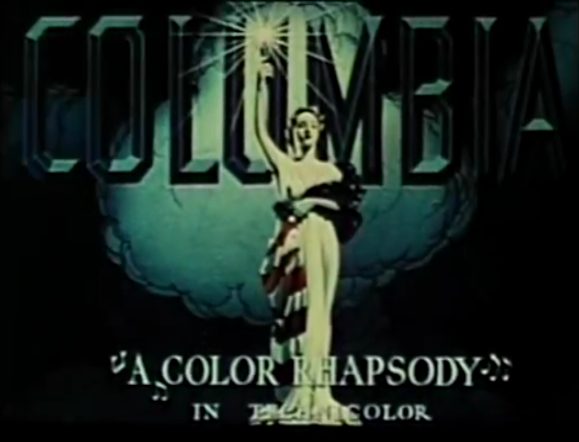
One of the most striking and long-established studio logos belongs to Columbia. Its robed, solitary lady clutching a torch against a cloudy backdrop, first seen in 1924, has bags of Old World class. The studio was founded by Harry Cohn, Jack Cohn and Joe Brandt.
With some variations, plus the odd detour, the logo has stayed much the same. Columbia Tristar saw the lady share credit with a winged horse, and Coca Cola’s ownership of the studio reportedly led to her figure resembling the shape of a glass bottle.
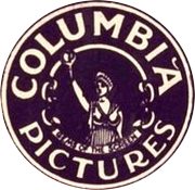
According to the Reel Classics website from 2001, “the facts get a little fuzzy in places and are completely missing in others…. though multiple models have come forward over the years and claimed to have posed as the original lady, Columbia Pictures themselves (now owned by Sony Pictures Entertainment) says they have no records or documentation to verify any of the claims.”
In the 1990s artist Michael J. Deas updated the logo, using Louisiana housewife Jenny Joseph as inspiration. Joseph posed for the image on a cardboard platform holding a rudimentary lamp.
3. Dreamworks
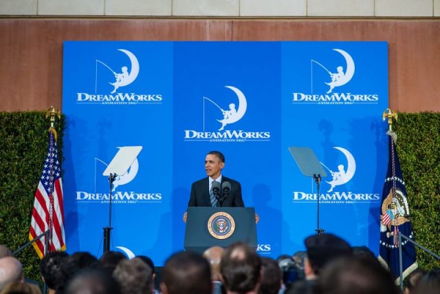
Though relatively short-lived as a studio, Dreamworks SKG made a lasting impression with its whimsical logo. Introduced in 1994, it was the calling card for Steven Spielberg, Jeffrey Katzenberg and David Geffen (the “SKG” part of the title).
The elaborate sequence sees a fisherman casting his line from the crest of the moon. That crest then forms the “D” in the company name before the camera pans along to reveal the logo in its entirety.

In 2012 TIME Magazine wrote that, “Spielberg always wanted to use an image of a man fishing from the moon — and decided the best way to create that was via CGI…. visual-effects legend Dennis Muren, suggested that Spielberg also consider using a painting and commissioned Robert Hunt… One of Hunt’s alternative versions included the nostalgia-inducing image of young boy fishing (with his son as model for the youthful angler). Spielberg was taken with this concept and a motion version was created at ILM (Industrial Light and Magic).”
The result has remained largely unchanged, though Dreamworks’ Animation wing depicted a man arriving on the moon via a bunch of balloons. That stirring music heard over the spectacle is composed by Spielberg’s frequent collaborator John Williams.
2. Warner Bros

When it comes to big and bold, Warner Bros. are among the most attention-grabbing studio logos. With that “WB” displayed in dynamic perspective on a gold shield, it shouts its credentials loud and proud.
The idea of Albert, Harry, Sam, and Jack Wonskolaser having their adapted surname of Warner up on a shield first appeared in 1923, five years after the family studio was founded.
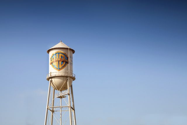
An interesting detail about the the logo is its adaptability. A 2014 article for Fast Company noted that “Filmmakers have always been encouraged to tailor it to suit the individual tone of their films.
The first stylized Warner Bros. logo appears as early as 1938’s The Adventures of Robin Hood, in which the shield is rendered as if it were a royal crest. In the late 1990s, with the rise of CGI, stylized use of the Warner Bros. logo exploded.”
It even got the Hitchcockian treatment in 1972 when a more abstract version was created by designer Saul Bass. Bass had often worked alongside the Master of Suspense.
Not one to play down their successes, the Warner logo is accompanied by ‘When Time Goes By’ from Casablanca (1942).
1. MGM
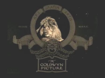
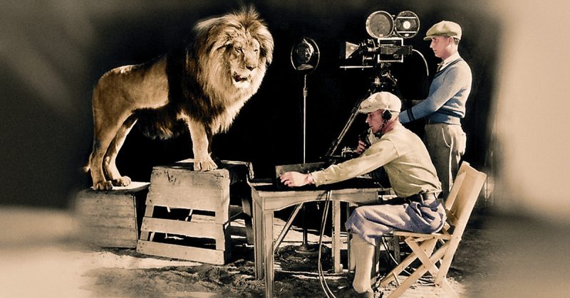
Arguably the most recognizable studio logo is the lion-taming emblem of Metro-Goldwyn-Mayer. The striking and somewhat dangerous-looking image of a big cat inside a ring with a scroll effect made its debut in 1924.
The concept however had been in existence since 1916, where it was used for the Goldwyn Picture Corporation. Publicist Howard Dietz had been inspired by his days at Columbia University, whose athletic teams were called the Lions.
Goldwyn Picture Corporation joined forces with Metro Pictures Corporation and Louis B. Mayer Pictures seven years later and the legend roared. Or rather it looked out at the audience — the distinctive roar wasn’t added till the coming of sound.
https://www.youtube.com/watch?v=PAprxJ7KvjY
Various lions have been filmed for the logo, the very first of which was named Slats. In 2012 Mental Floss wrote that he “was trained by Volney Phifer, Hollywood’s premier animal trainer, and the pair toured the country to promote MGM’s launch.
The two became close, and when Slats died in 1936, Phifer had the body sent to his farm and buried it there, marking the grave with a granite slab and a pine tree to ‘hold down the lion’s spirit.’”
Read another story from us: How a Movie About a Pig Inspired James Cromwell to Change his Life
The most recent addition to MGM’s pride was Leo, whose image has been displayed since 1957. Notable spoofs include a vampiric lion in The Fearless Vampire Killers (1967) and Tom from Tom & Jerry.
